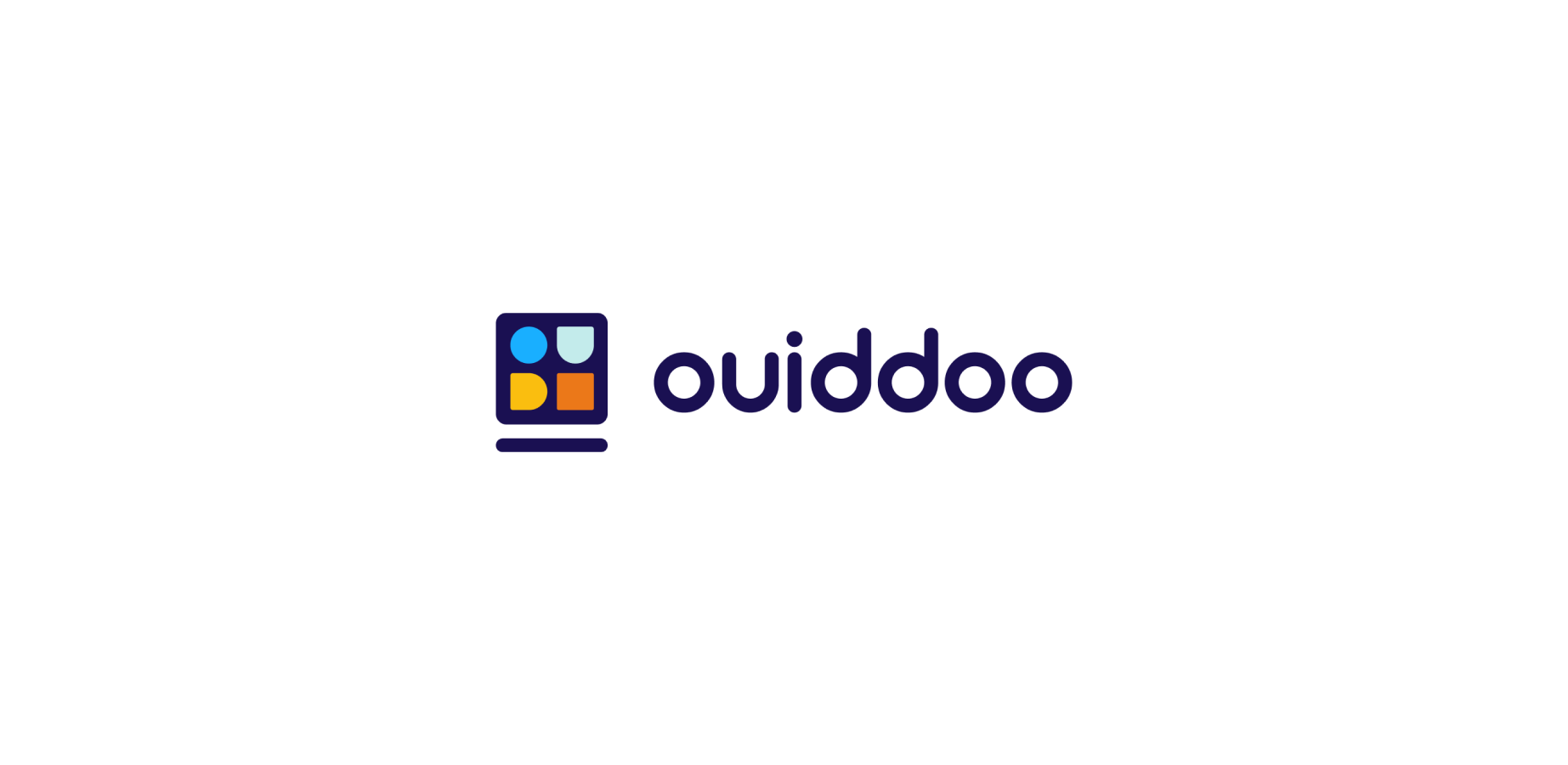
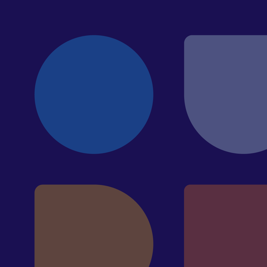
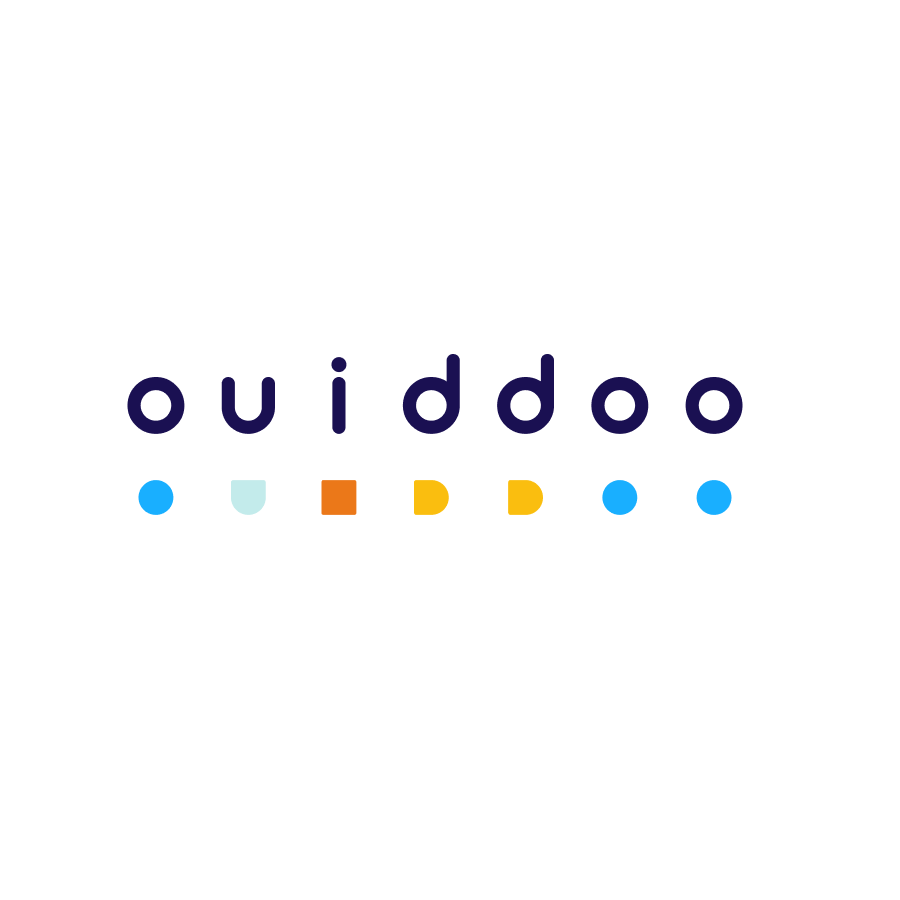
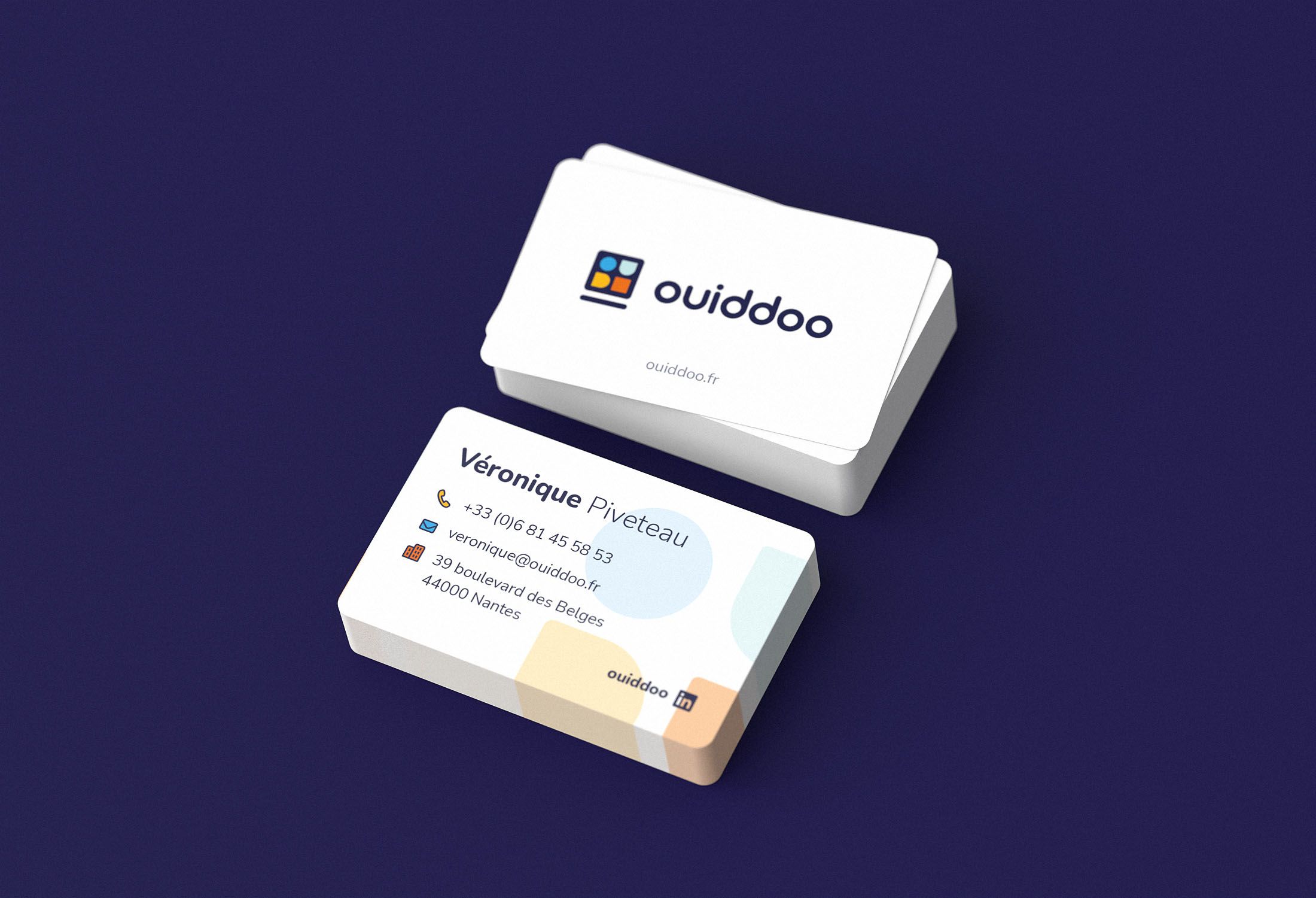
Each shape in the logo represents a letter of ouiddoo. These shapes are integrated into a computer, represented by the square (for the screen) and the bar (for the keyboard), to symbolize e-learning.
Ouiddoo
Training
brief
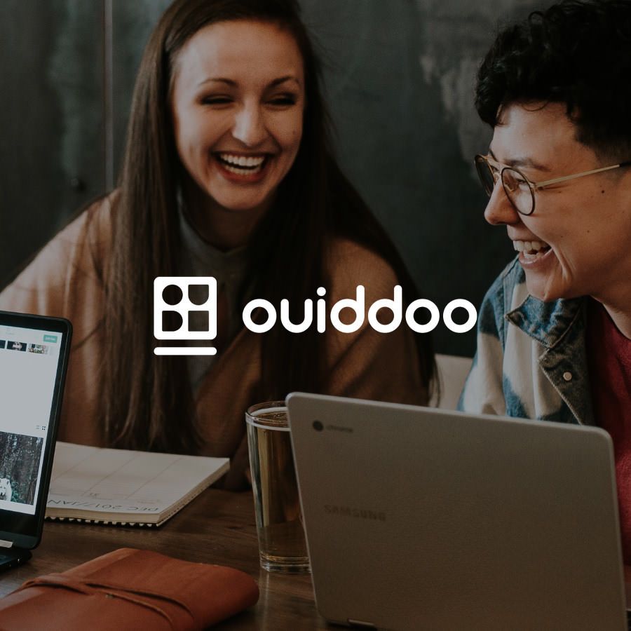
Ouiddo is an official partner of Odoo, an open-source ERP and CRM solution. The platform offers physical and remote training to support project teams and end-users. The customer required a logo that was to be playful, colorful, and modern. The goal was to simplify the letters O, U, and I into basic shapes, evoking the playfulness of geometric shapes.
Role
- Art Direction
- Graphic Design
Deliverable
- Visual Identity
- Pitch Deck
Logo design
Graphic elements
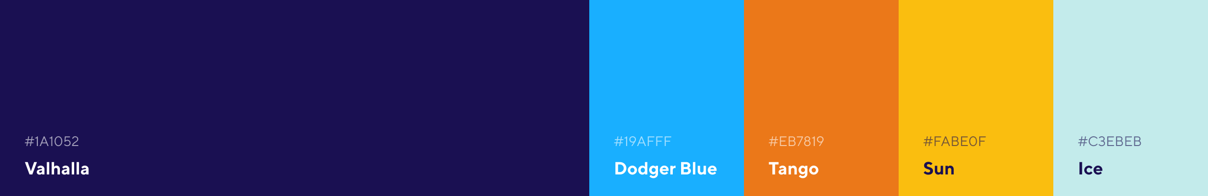
Color palette
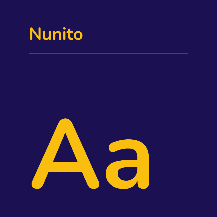
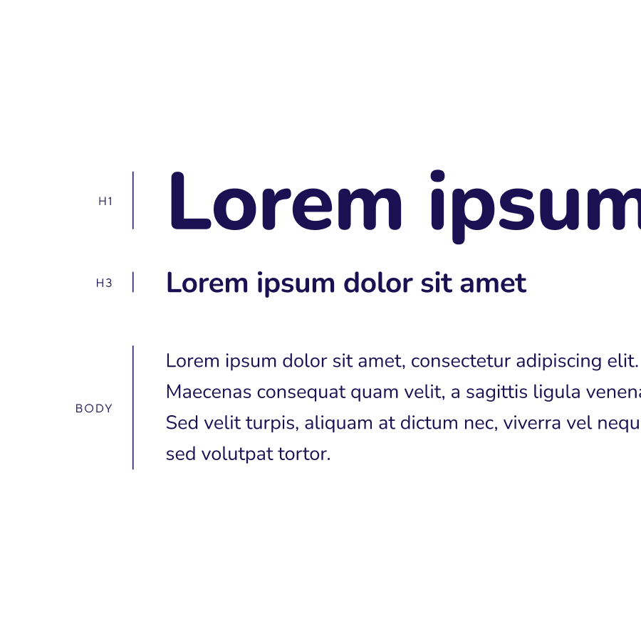
Typography
Business cards
PowerPoint presentation

Photo credits
P.Factory, Unsplash, iStock.
Date
2021